
I'm sure every Etsy shop owner will have heard of the shop home redesign that Etsy is rolling out this month. The purpose of this is to give shop owners more creative control including branding. In addition everything will be on one page. Currently we have until April 5th to edit our shops before the new look will go live for all buyers to see. While I'm all for change if it helps me get more exposure, the timing is a bit unfortunate as the first quarter is typically my busiest of the year. Nevertheless, I made some preliminary changes. Here's an overview.
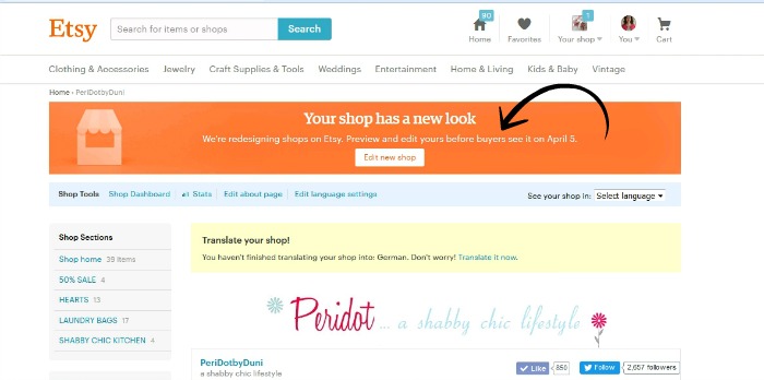
This is how my shop home page looks right now. Clicking the edit button at the top will lead you to the new shop from where you can fine-tune the new look.
There are now three banner options available.
- small banner 760 px x 100 px
- cover photo minimum 1200 px x 300 px
- none
I tried all three, but finally went with a large cover photo that shows some of my bestselling work. I made it a little taller to accomodate my larger pieces. The small banner is what I had originally, but it won't be visible on mobile devices and choosing none leaves too much white space for my taste.

Also, since I've received a lot of compliments on the new look of my blog, I'm considering having a custom logo to replace the current shop icon (the two hearts). In my opinion the shop owner picture could be a little larger. It looks kind of lost...
Featured listings are right below the header. They are a bit larger, and same as before you may choose up to four images. I didn't previously have any items featured, because the overall look was much more compact, but in the new shop I wanted to fill that gap between the header and the listings. Also, the about and policies sections that were previously on the left sidebar are now above the featured listings. These are a bit difficult to spot at first. The shop announcement has moved to underneath the featured listings.

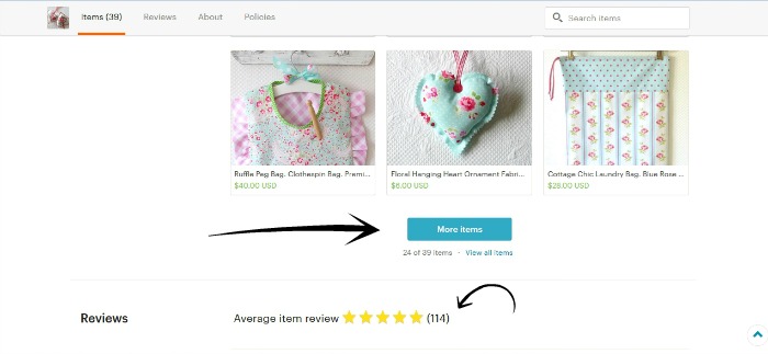
And finally...the actual listings. While editing my new shop I realized that buyers will need to do a lot of scrolling up and down. Not sure how they will feel about it. I know that some don't like scrolling prefering to click through the pages instead. But in the new shop there are no pages! Instead there is a button to click at the bottom of the home page to show more items, much like Google images. Reviews are now visible right beneath the listings. Now more than ever it's crucial that the latest review that most buyers will read when scrolling down that page has a high rating.




 //
//